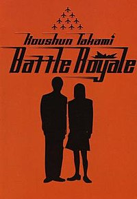
 Can't really find an image that captures the particular shade of red, annoyingly. Still, it's great. Took me ages to notice the dot on the "i" in "Takami" is a little cartoon bomb.
Most of the Murakami covers done by Vintage for the UK copies are ace, but I especially like this one because I am all about the minimalism. The US covers are generally top-notch, too, but I'm just doing one per author here. I also like the one that's just a glass of milk (Penguin Classics?), but this is so much more Sixties. Plus, my dad's copy of the book is this one, and it's the first copy of it I saw, so association. (My copy is from The Independent's "Banned Books" promo thingy of a year or two back, and is orange with a screaming guy straining against a chain stretched across his face. Okay, but a bit obvious.)
 One of my favourite conceits is the "use a classic painting that isn't directly anything to do with the book but shares themes" idea, ably illustrated by this pairing of that painting I can't remember the name of (Experiment with a Bell-Jar? Something like that?) by a painter I can't remember the name of, and that book where the guy makes a monster or something. This was the copy of the book I owned until I actually read it and discovered it to be the third-most boring book I'd ever read. (The second was Pride & Prejudice and the first was Persuasion, so clearly I am an unenlightened philistine. I liked Northanger Abbey, though.)
 Just lovely. I thought it was just waves under the boat when I first saw it.
I also like the one that's just a glass of milk (Penguin Classics?), but this is so much more Sixties. Plus, my dad's copy of the book is this one, and it's the first copy of it I saw, so association. (My copy is from The Independent's "Banned Books" promo thingy of a year or two back, and is orange with a screaming guy straining against a chain stretched across his face. Okay, but a bit obvious.)One of my favourite conceits is the "use a classic painting that isn't directly anything to do with the book but shares themes" idea, ably illustrated by this pairing of that painting I can't remember the name of (Experiment with a Bell-Jar? Something like that?) by a painter I can't remember the name of, and that book where the guy makes a monster or something. This was the copy of the book I owned until I actually read it and discovered it to be the third-most boring book I'd ever read. (The second was Pride & Prejudice and the first was Persuasion, so clearly I am an unenlightened philistine. I liked Northanger Abbey, though.)Just lovely. I thought it was just waves under the boat when I first saw it.
Well, obviously. This picture seems to have a darker, more detailed tint than my copy, oddly - mine's very much block primary colours, which I like as an offset to the realistic style within.
